不管是什么布局,Flex往往都可以几行命令搞定。
我只列出代码,详细的语法解释请查阅《Flex布局教程:语法篇》。我的主要参考资料是Landon Schropp的文章和Solved by Flexbox。
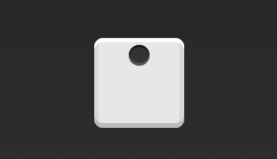
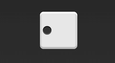
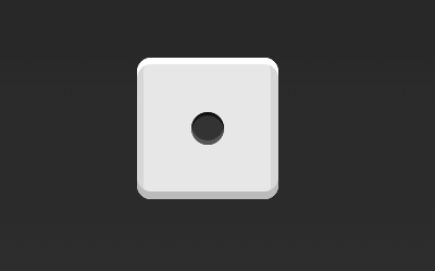
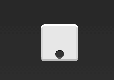
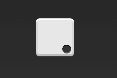
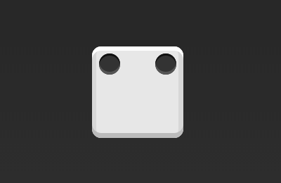
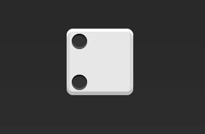
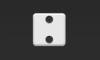
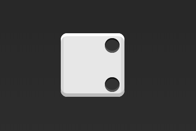
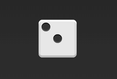
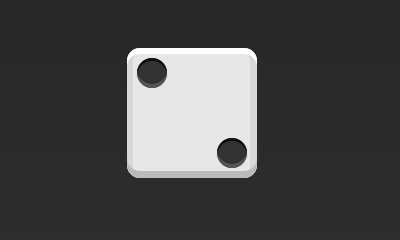
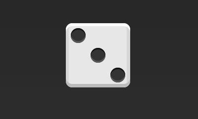
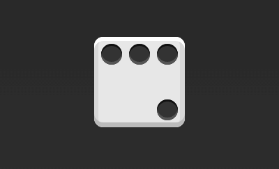
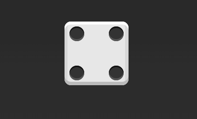
一、骰子的布局骰子的一面,最多可以放置9个点。
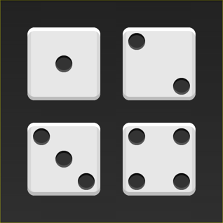
下面,就来看看Flex如何实现,从1个点到9个点的布局。。
如果不加说明,本节的HTML模板一律如下。
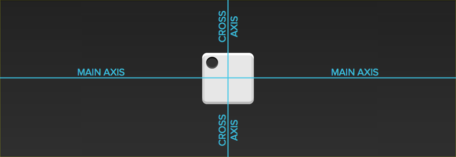
<div class="box"> <span class="item"></span> </div>上面代码中,div元素(代表骰子的一个面)是Flex容器,span元素(代表一个点)是Flex项目。如果有多个项目,就要添加多个span元素,以此类推。
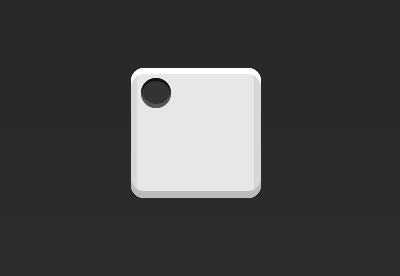
1.1 单项目首先,只有左上角1个点的情况。Flex布局默认就是首行左对齐,所以一行代码就够了。
.box { display: flex; }
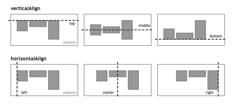
设置项目的对齐方式,就能实现居中对齐和右对齐。
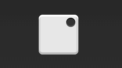
.box { display: flex; justify-content: center; } .box { display: flex; justify-content: flex-end; }设置交叉轴对齐方式,可以垂直移动主轴。
.box { display: flex; align-items: center; } .box { display: flex; justify-content: center; align-items: center; } .box { display: flex; justify-content: center; align-items: flex-end; } .box { display: flex; justify-content: flex-end; align-items: flex-end; } 1.2 双项目 .box { display: flex; justify-content: space-between; } .box { display: flex; flex-direction: column; justify-content: space-between; } .box { display: flex; flex-direction: column; justify-content: space-between; align-items: center; } .box { display: flex; flex-direction: column; justify-content: space-between; align-items: flex-end; } .box { display: flex; } .item:nth-child(2) { align-self: center; } .box { display: flex; justify-content: space-between; } .item:nth-child(2) { align-self: flex-end; } 1.3 三项目 .box { display: flex; } .item:nth-child(2) { align-self: center; } .item:nth-child(3) { align-self: flex-end; } 1.4 四项目 .box { display: flex; flex-wrap: wrap; justify-content: flex-end; align-content: space-between; }HTML代码如下。
<div class="box"> <div class="column"> <span class="item"></span> <span class="item"></span> </div> <div class="column"> <span class="item"></span> <span class="item"></span> </div> </div>